

Development: After doing the reversed broken mirror concept for the @LUNAREYLA logo, and the practical background ripping for the Z3 FILMS logo I wanted to find something different for this one. So I kept my eye out for interesting visuals and concepts being done out in the world. I pulled together a handful of different ideas and let them simmer in my mind for awhile.
The Letters: At some point I decided that I wanted to use physical letters, something tangible as the basis for the logo. My original idea was to purchase cardboard letters because I thought I had seen them at a store recently. I searched everywhere and couldn't find said cardboard letters anywhere near me but I did find some wooden ones in the size I was looking for. So I purchased them and returned home and painted them all a dopey lime green. Then I dirtied them up a bit and let them dry while and then I kind of lost my inspiration. So I took some time to develop the concept a little more.
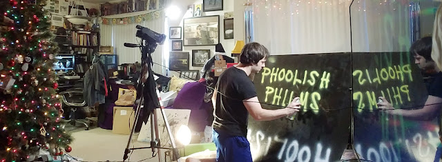
Production Shoot #1: Eventually I took a break from editing (the myriad of projects I have on my slate right now) and made a day out of experimenting with several of the ideas that had been floating around in my head. I tried a few things with spray painted lettering, water spray and smears, and also shot some stuff with the tangible wooden letters. This by default, added more color and texture to the letters. With the footage I cut a few options together but none of them were worthy of being the logo. So I sat the project aside for a little while longer...
Production Shoot #2: Then a new idea sparked one morning. I'm not sure where it sparked from but I'm certainly glad it did. The concept was to have the letters hanging towards the camera and moving subtely. So over the course of a few days, I started stapling yarn to the letters, guiding them through punched holes in a large desktop computer box that I had previously painted black (originally to be used for the Z3 Logo Background plate), and then I hung that box up in a doorway. This allowed the letters to fall strangely and independently of each other. I tried several variations in lighting and focus - with plates of all of the letters holding still, moving all over the place, and even pulled up tight against the cardboard.
Post-Production: Once I got all of the new plates into the computer I started playing around with the different options. I played with different timing effects and altered the colors. I had recently purchased some VHS overlay filters and felt like those would help hit the overall idea home as well (our roots are in the land of VHS afterall!). Phoolish Philms has always had a cool homemade essence in my mind. So to me, this logo really represents it well.
Check out a behind-the-scenes video HERE!
No comments:
Post a Comment